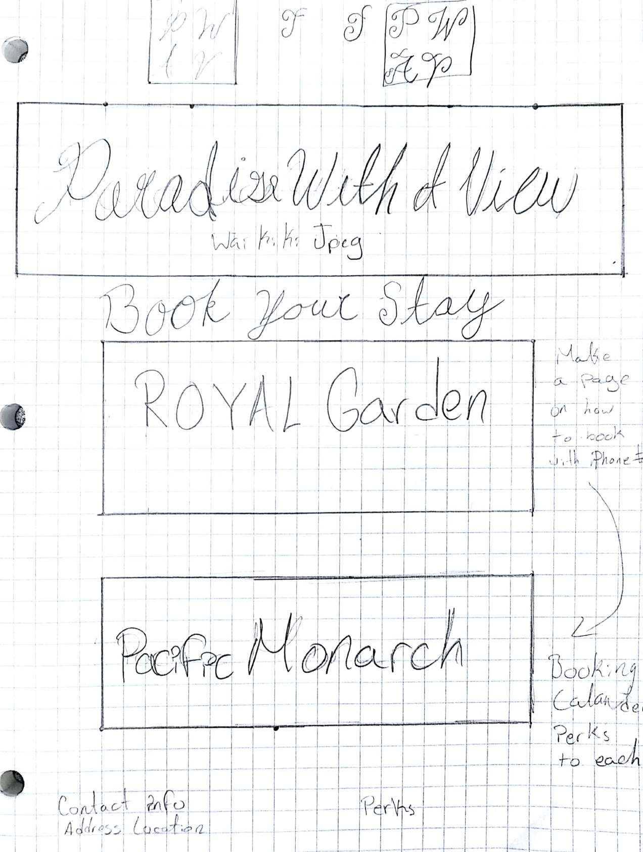
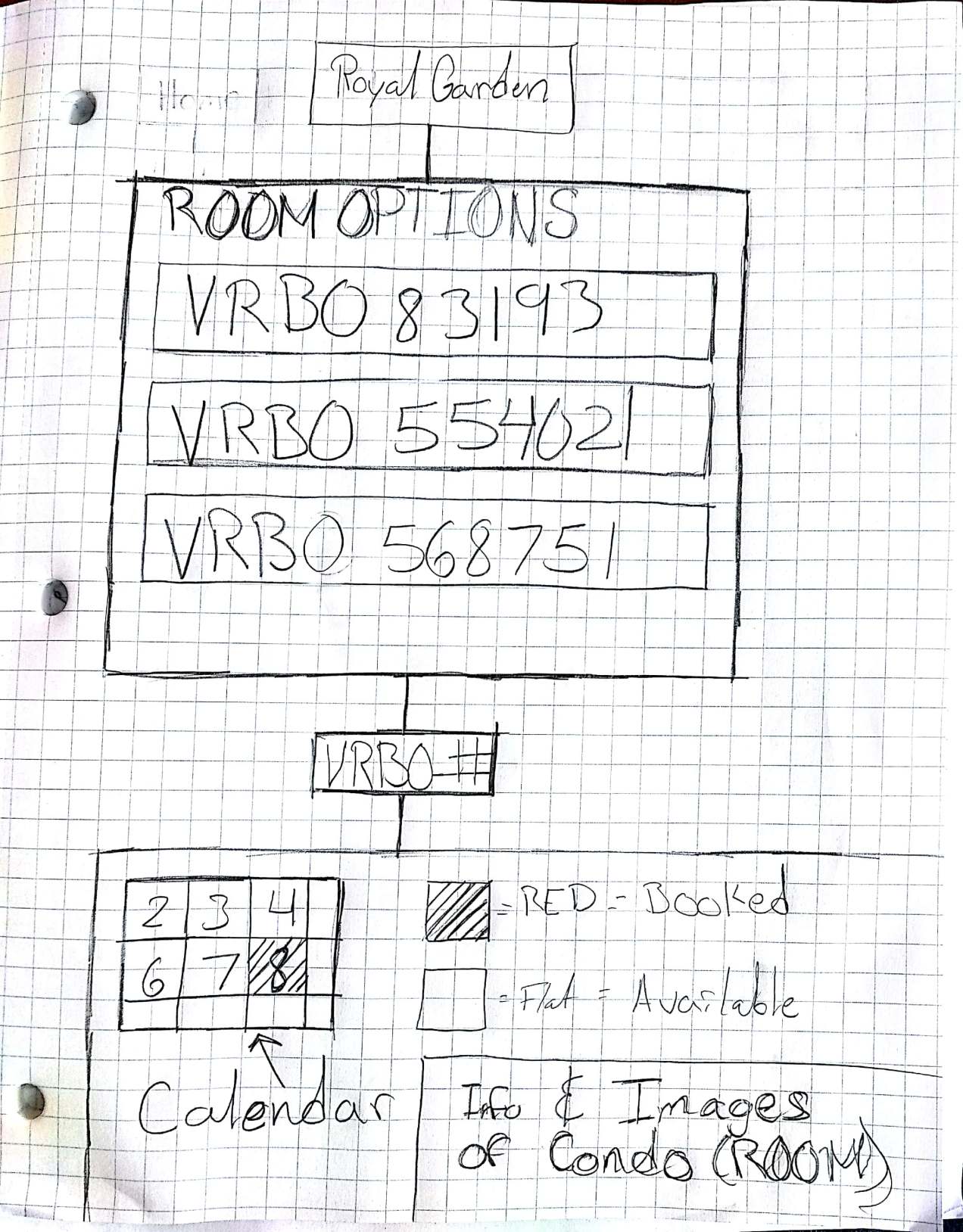
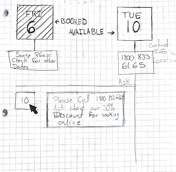
paradisewithaview.com is a very simplistic website that had way too many things on it to even understand. the creators were perhaps worried that it would look empty since they can only rent about four rooms so they repeated information a lot. mainly the free wifi. my job now is to see that the colors of the website have a more modern look to them rather than a 90s look or an effortless one. the cursor has text following it around wich can get in the way of some other text and make the customers not see certain things. another thing that bothered me is that i couldnt book a room without having to call so perhaps that could be improved so that people could have the option to pay online or by phone.